QShala Rebranding

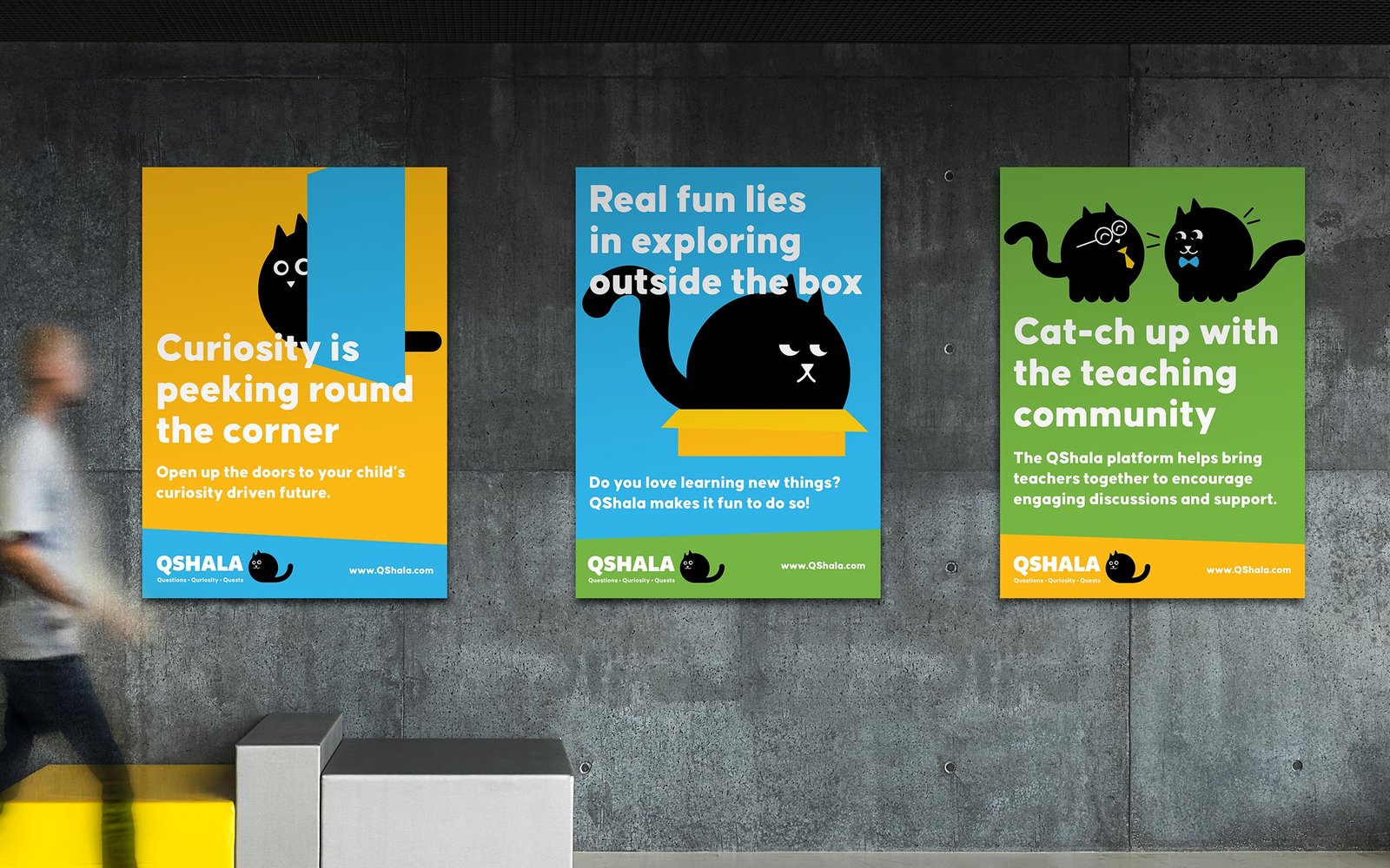
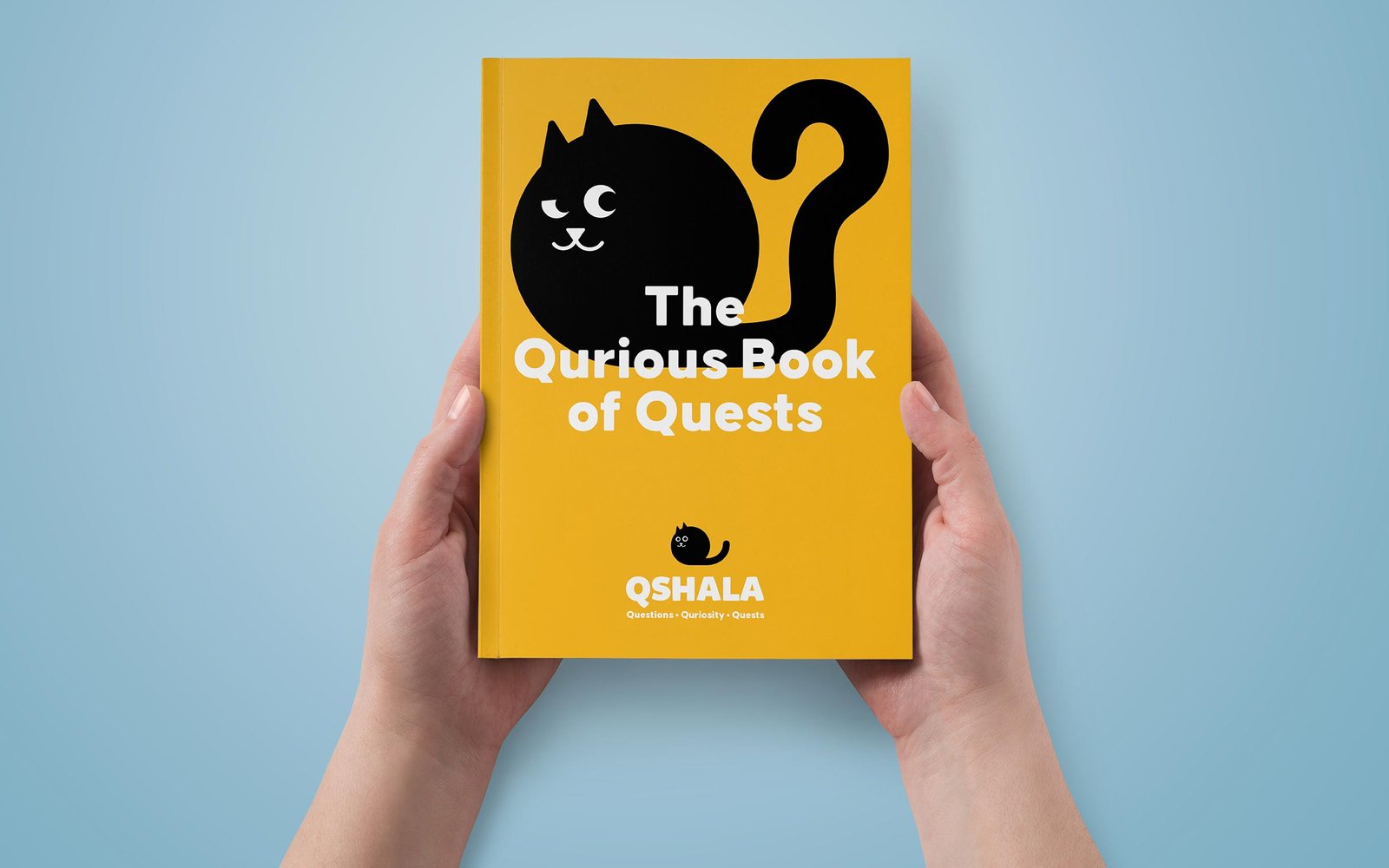
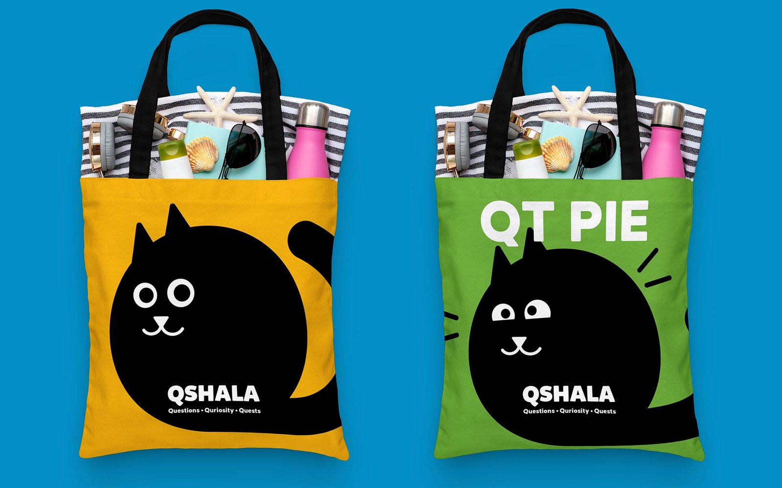
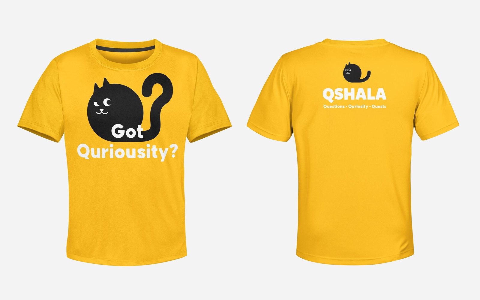
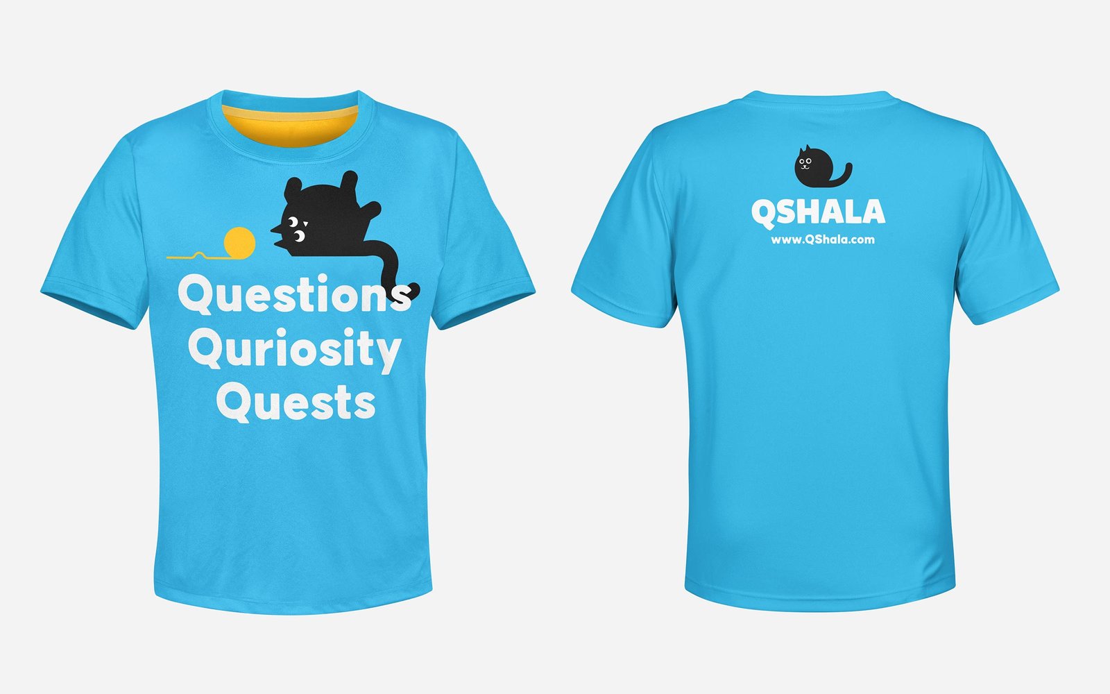
QShala is an essential learning platform that encourages creativity, curiosity and compassion. The brand’s primary focus domain is school going children and their parents. QShala exists to:

  • Help children break free of rote learning attitudes and keep up with the complex and changing times.
  • Associate learning with fun and imbibe curiosity as the way to think and grow.
  • Lay the groundwork for a healthy, engaged and curious citizenry.
  • Aid hobby exploration, career exploration and stakeholder connect in future.


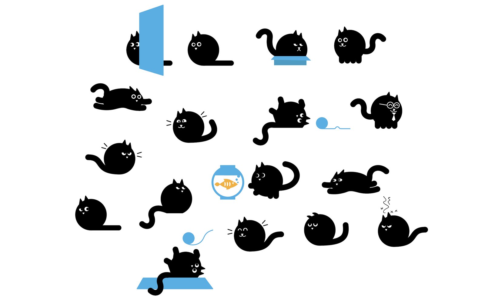
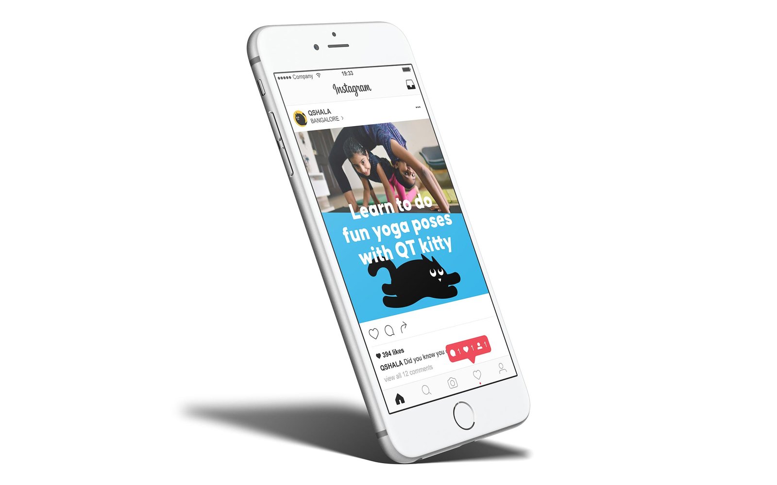
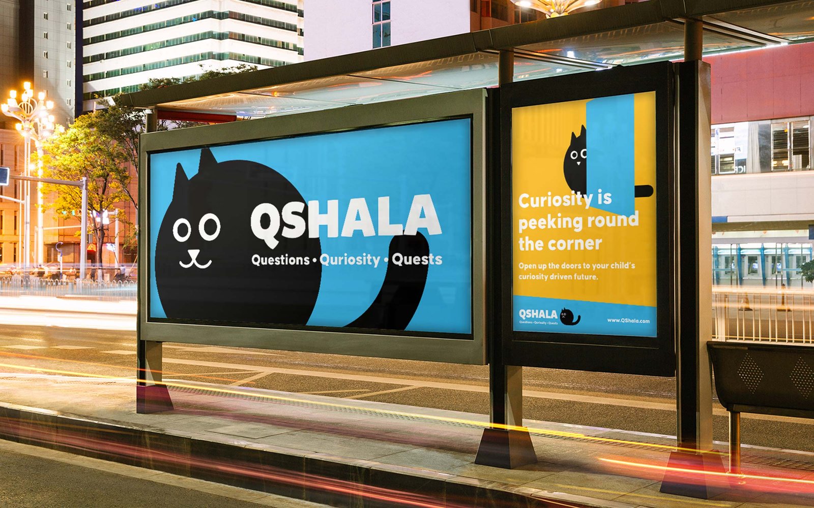
We worked with QShala to do the complete rebranding exercise, including brand strategy, visual identity, website design and quizzing platform UI design.

Core Value Statement

Visual Identity

QShala’s identity system has a mascot, lovingly called QT. Inspired by the form of letter Q, QT is a curious being that embodies every trait of a constantly curious, exploratory, creative cat. It rolls, it falls, it sticks out its tiny paws to reach out for wool and everything else that we love about curious cats.


The copywriting uses these visual metaphors to translate communication for parents, children and teachers effectively and succinctly, without breaking character and losing the curious and fun spirit. The colours work towards aiding this simple yet bold visual language system to speak to the audience exploring the connection with QT and curiosity.


QT Animation by Kalp Sanghvi, for QShala.

Website Design

We also continue to work extensively with QShala team to strategize and design various digital products for them, including their website, an online quizzing platform and more.