Striker App UI Design

Striker is a card collection game that allows you to own cards from various matches of cricket and other sports. You purchase packs, collect cards and trade them to build the best card collection out there. The cards increase or decrease in their value depending on the players performance in the real world match. The product is owned and managed by MPL Gaming.


We worked closely with the Striker product team to design the UX, UI, various product elements, card designs, branding and motion design.

Motion Design

The motion design for the product interface was conceptualized right from the start, with us exploring splash screens even when product was worked under a dummy name. We designed the transitions between screens, behaviour of various match cards, cards reveal as well as skeleton loaders.

Home, PreMatch, InMatch and PostMatch Flow

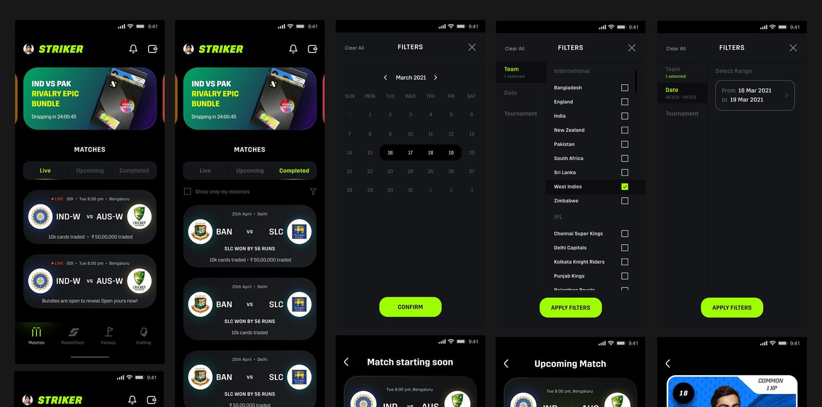
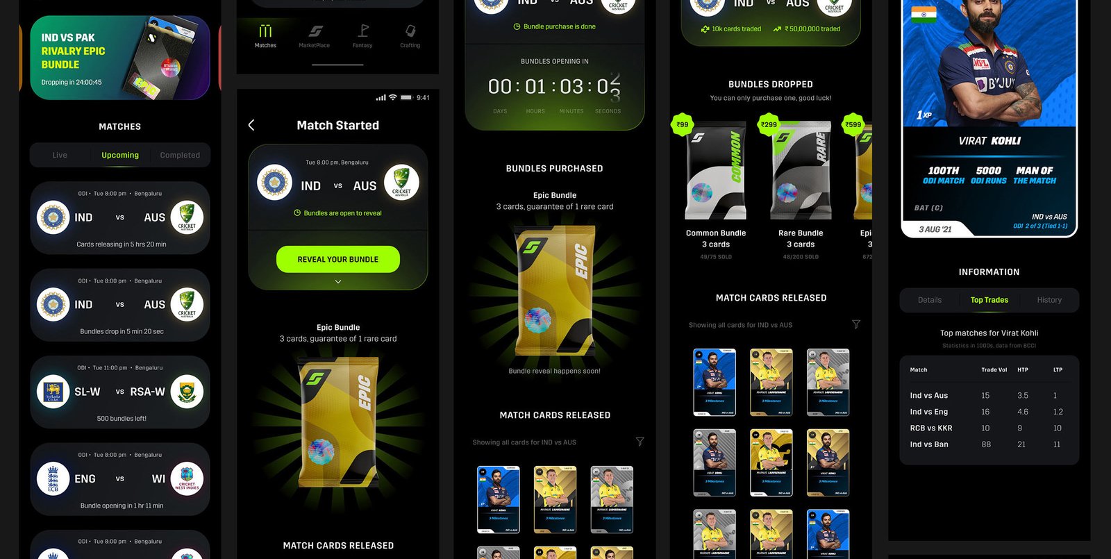
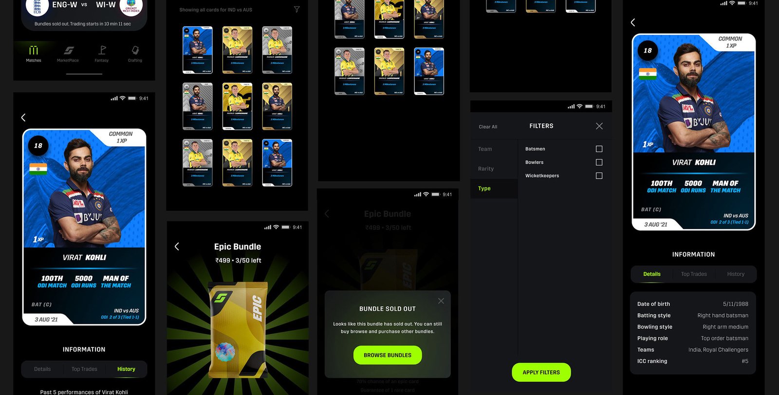
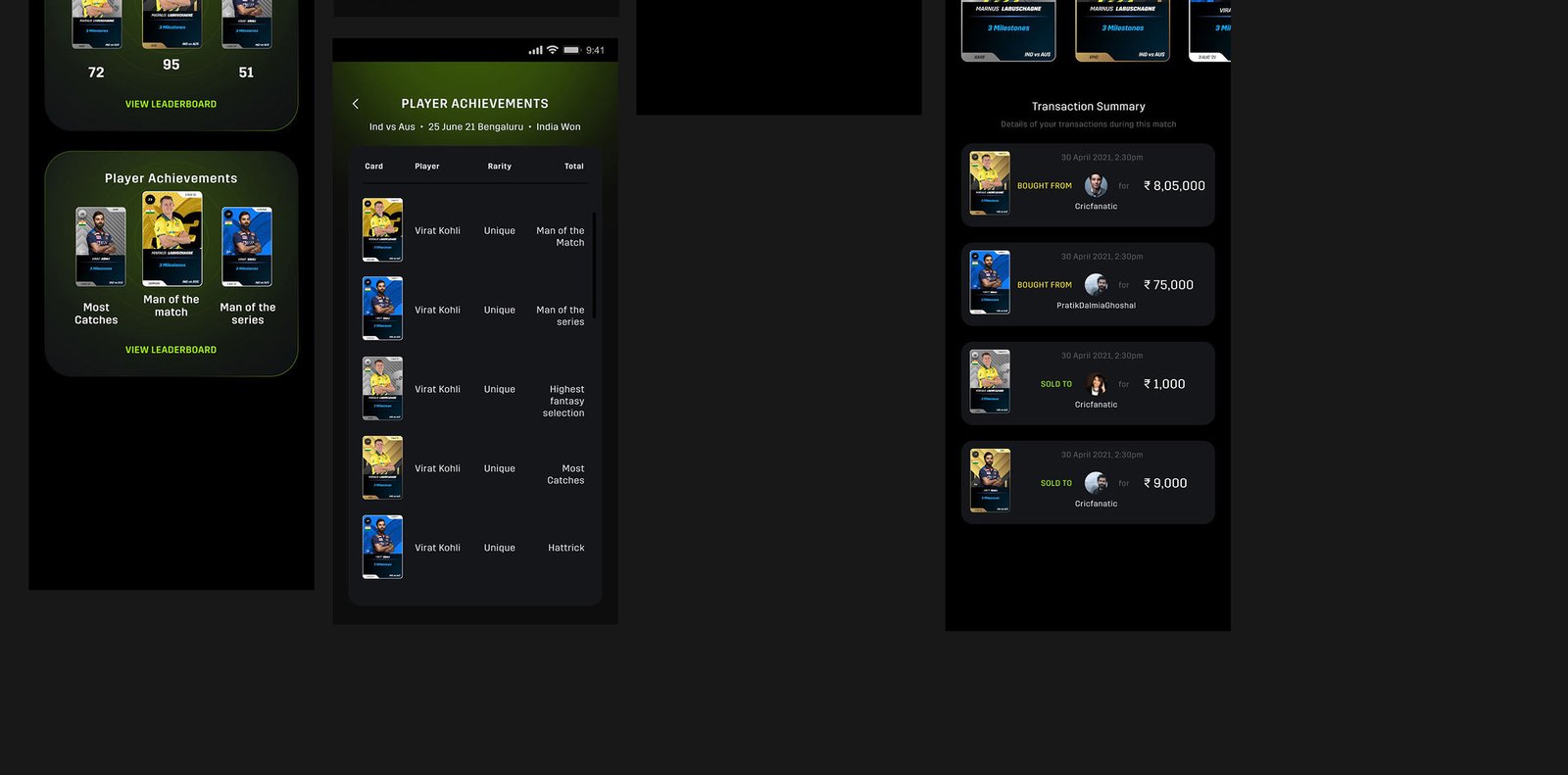
Shortlisted screens from the UI design for the above mentioned flows can be seen below. After the homescreen, users go through a prematch flow, where they can purchase card packs and explore players. Once the match starts, the users can trade cards, buy and sell, and even when the match is over, they can continue trading their cards.

Crafting your own cards

Once a user has earned enough tradecoins, they can craft their own cards of various levels, of a player of their choice.

Fantasy

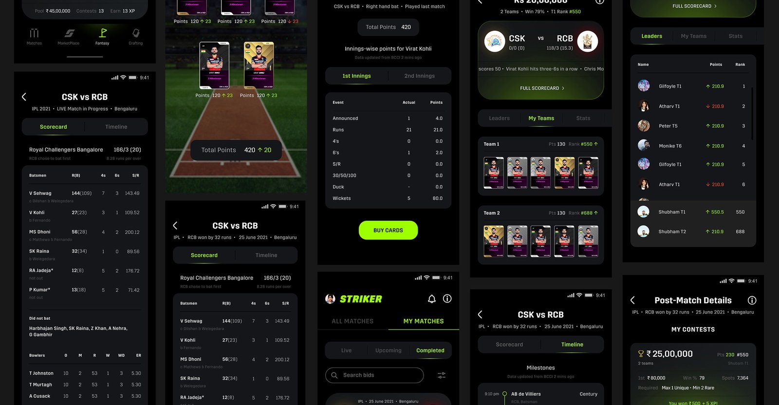
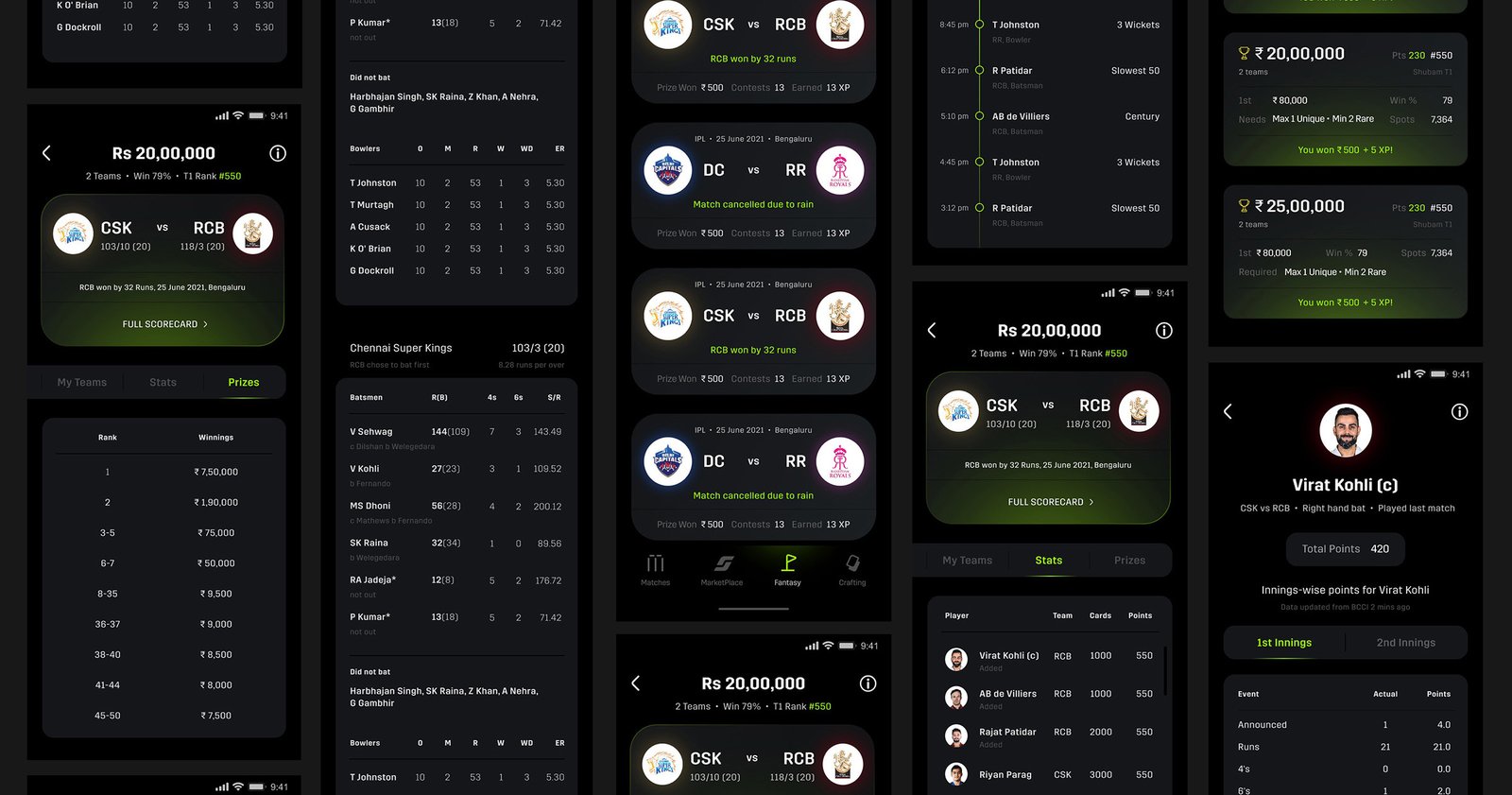
Users can also create their own fantasy teams in the app, and pit them against the other users’ teams. Seen below are the screens before a fantasy match starts.

Seen below are the inmatch and postmatch fantasy screens.

Login, Wallet, Search, KYC

Previews of screens from the rest of the app, including the flows above. Many error states, screen variations under different scenarios etc. were also designed for an exhaustive overview for the product development team.