Chapter Vitamins is a tech firm based out of Gurgaon, India that whitelabels and customizes it’s proprietary app for various clients, who use it train and teach their employees. It’s gamified to a small degree, with employees earning points/coins for every topic they learn and course they finish, as assigned by their employer.
I worked with them to re-design their app, bringing it up to date with modern design language as well as solve for various User experience and interface issues.
Audit of the old app
The very first step of the process was to do an audit of the existing app. The following problem areas were recognized:
The ill-designed navigation repeats the same content multiple times, navigating the user through various inefficient ways to the same end content.
The visual design of the app needed a serious overhaul.
The typography system was non-existent, so a new system needed to be designed.
User flow needed a clear objective, which was not done well in the existing app.
The onboarding process didn’t help onboard the user, leading to confusion in first time users.
Seen below are the slides from the questionnaire session with the client on the existing screens.
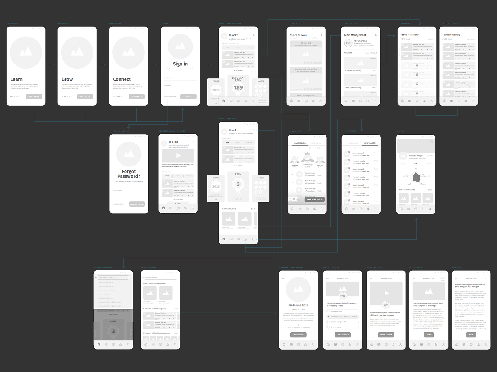
Wireframing and User flow
After having clarity on the problems areas to address in the app design, I first made a detailed wireframe of the whole app structure, clearly charting out the user flow pathways as well as establishing hierarchy of various elements and giving a consistent structure to the app. Some notable interventions were:
Introduction of a persistent bottom navigation bar to help the user go around the app efficiently.
Establishment of typographical and visual element hierarchy
Deploying a card based design system to help keep it modular and easily adaptable to various clients.
Overhauled search experience and leaderboard design.
Initial explorations with Motion UI
After having approvals on the wireframe for the app, I designed some of the screens in the app based on the wireframe. I also designed motion based UI animations on the screens to give a sense of context and transition between various screens. This also gave the client an understanding of how the app works in various sections.
App final UI, New User
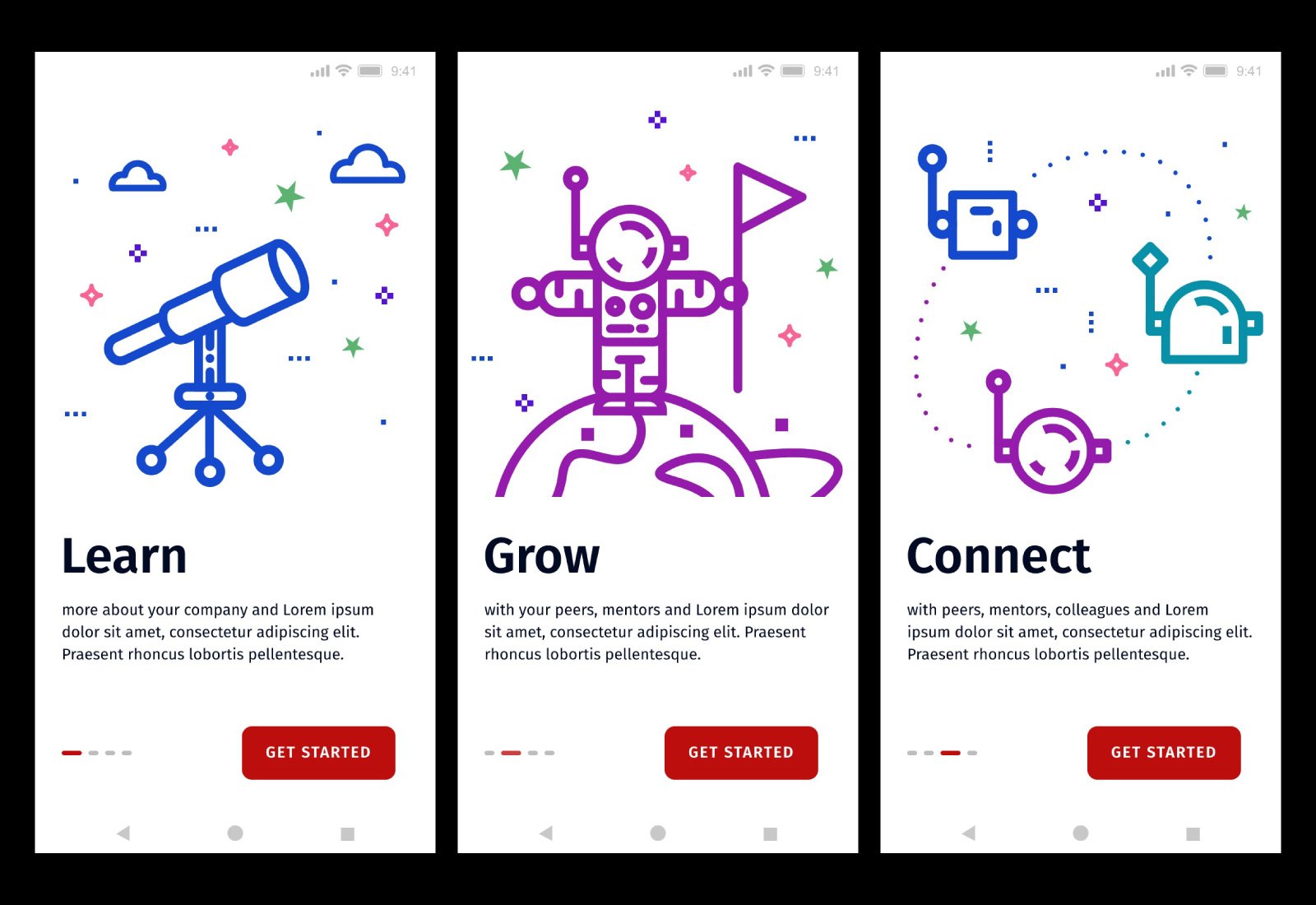
Based on the discussion on the Motion UI of some of the app screens, the client suggested to split the user flow in two parts. Part 1 is where a new user signs up on the app and the organisation gives a gamified, pre-defined learning experience to the new user. This flow doesn’t require a lot of navigation around the app, but pushes the user to finish this initial exercise before the whole app can be opened up for them.
Another change was in the visual style of the app. Chapter vitamins whitelabels this app to various other companies, adapting it to different themes and concepts. One of the popular ones is the ‘Space theme’, upon which this version was to be built from now onwards. So I designed the illustrations, colours etc. based on the same.
Onboarding illustrations and screens focusing on the learning that the user can do through the app.
Sign in process is now part of on-boarding process itself, leading to a smooth transition to the app.
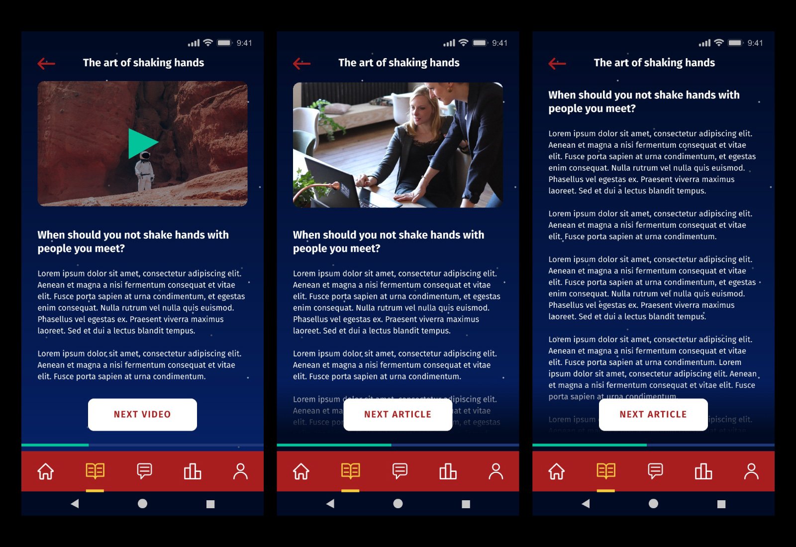
Introductory videos by the company for their users, followed by a mission based course UI.
Going through planet to planet, users can accomplish various missions along this journey.
Layouts showing video + text, Image + text, text only screens.
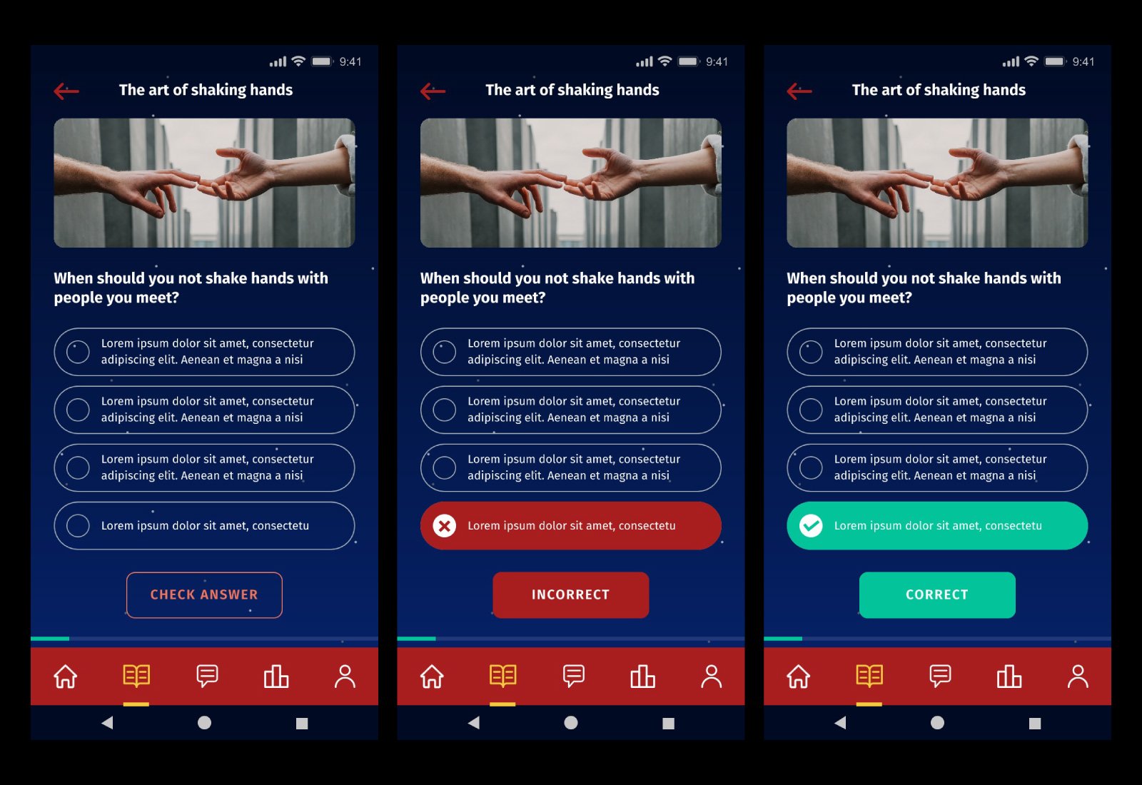
Quiz UI
App final UI, Existing User
Once the user has been through the orientation flow, they are introduced to the full, detailed app where they can do all the other courses that their company has planned for them. Seen below are the screens for this ‘existing user flow’.
Long form home screen, with direct links to go to suggested materials, making user consumption of content as fast as possible with least effort. Motion UI helps transition between the light and dark screens in the app.
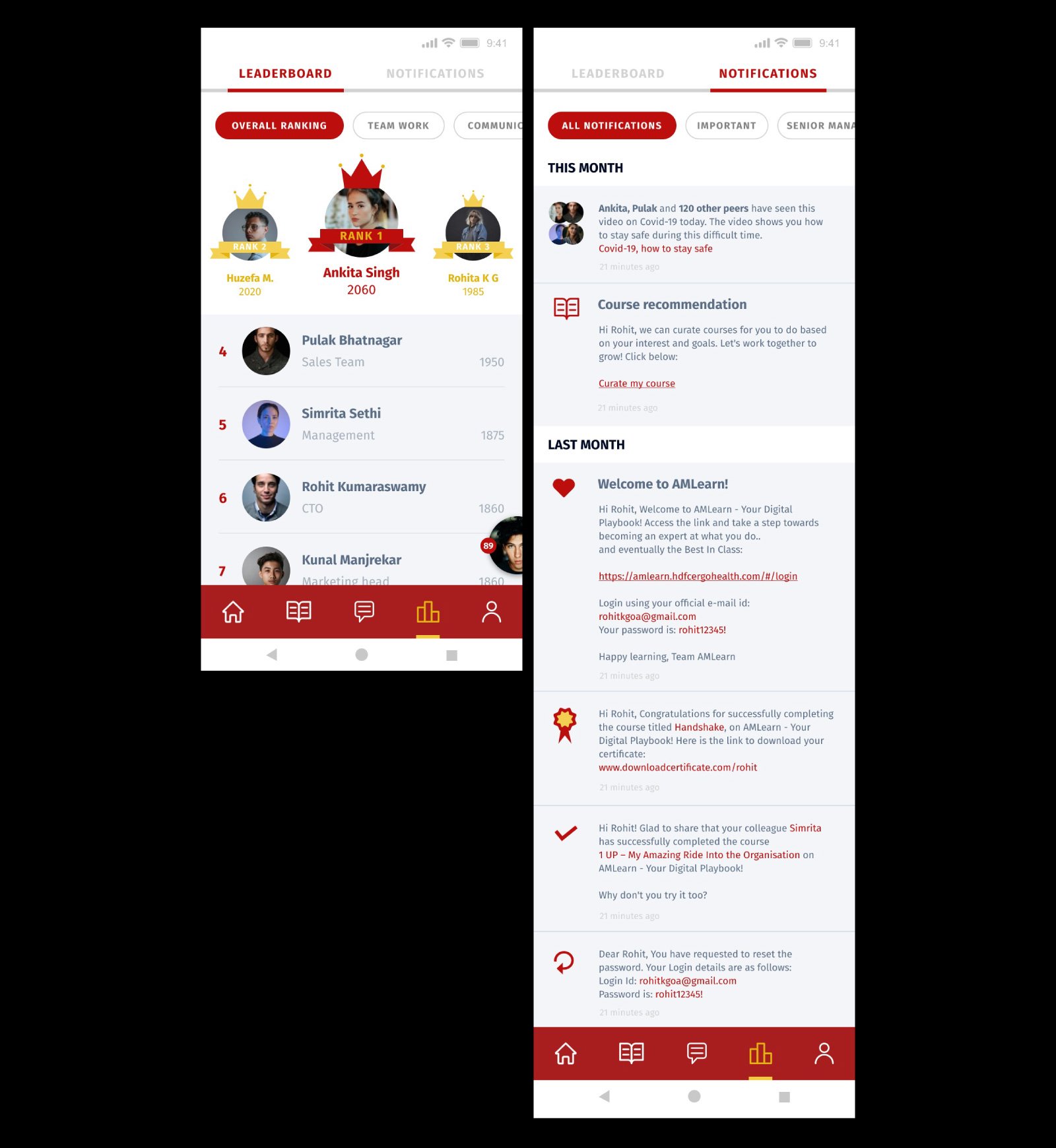
Leaderboard design helps promote healthy competitiveness between users as well as quick check of your points. There’s also the ability to filter the leaderboard depending on various criteria, like organisation levels or course names. The notification UI groups your notifications according to time and month, with quick links to navigate across the app based on organisation needs.
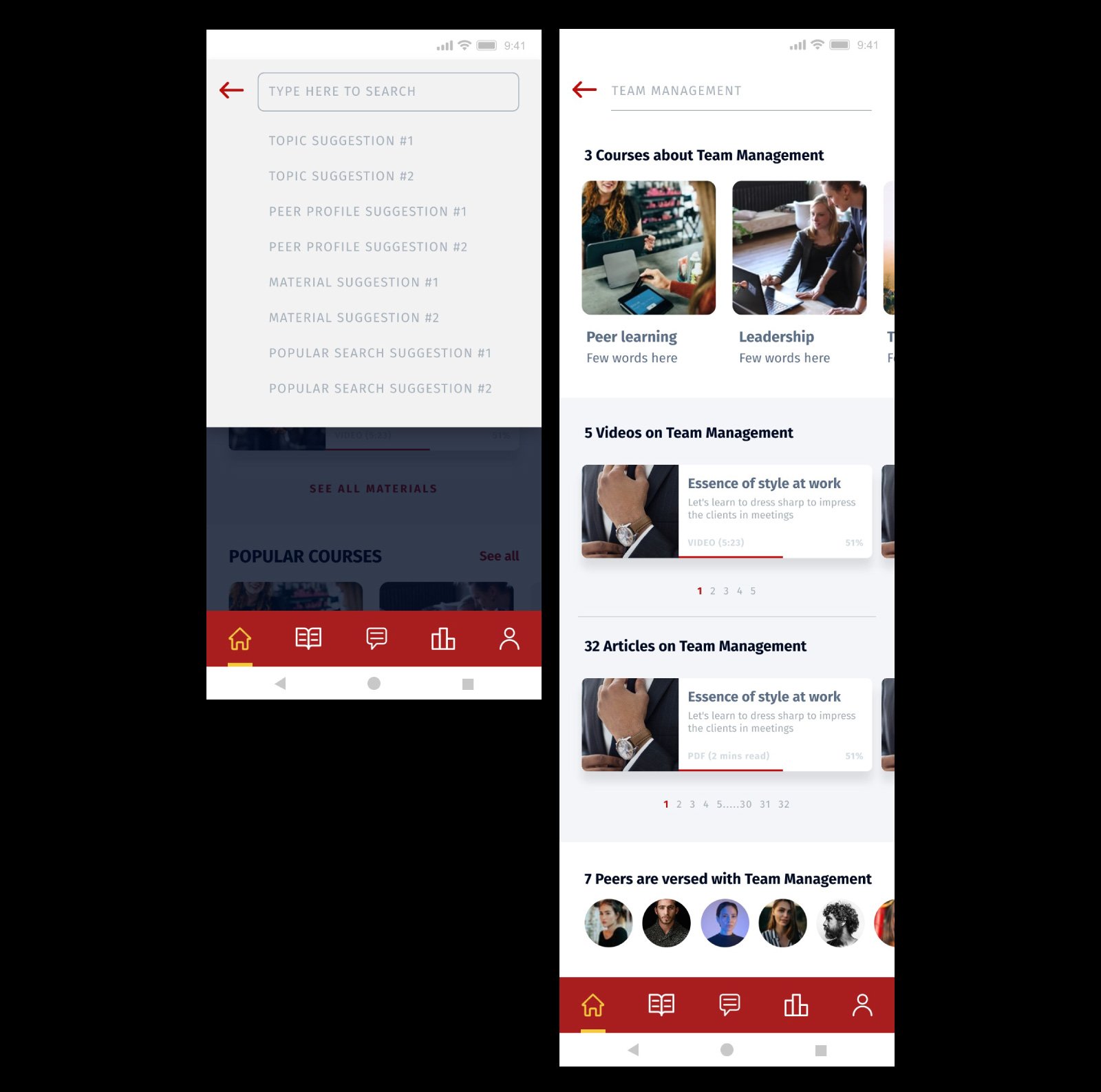
The search experience is intelligent, as it gives suggestions based on various criteria and shows the results in carefully grouped layouts.
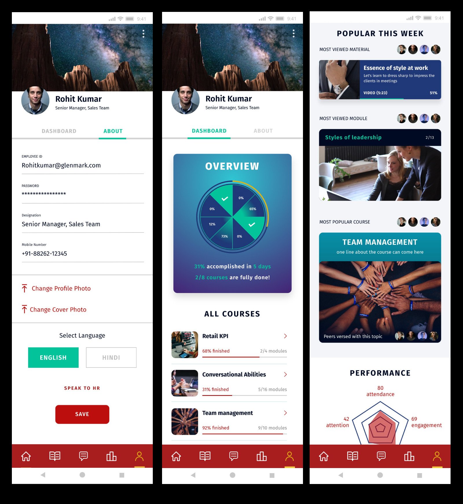
The profile screen has options to edit your details as well as see your statistics on the dashboard. The dashboard also shows how much you’ve progressed in various courses, with ability to quickly jump to those courses, see what’s popular in your organisation as well as see your overall performance to discuss later with the HR.
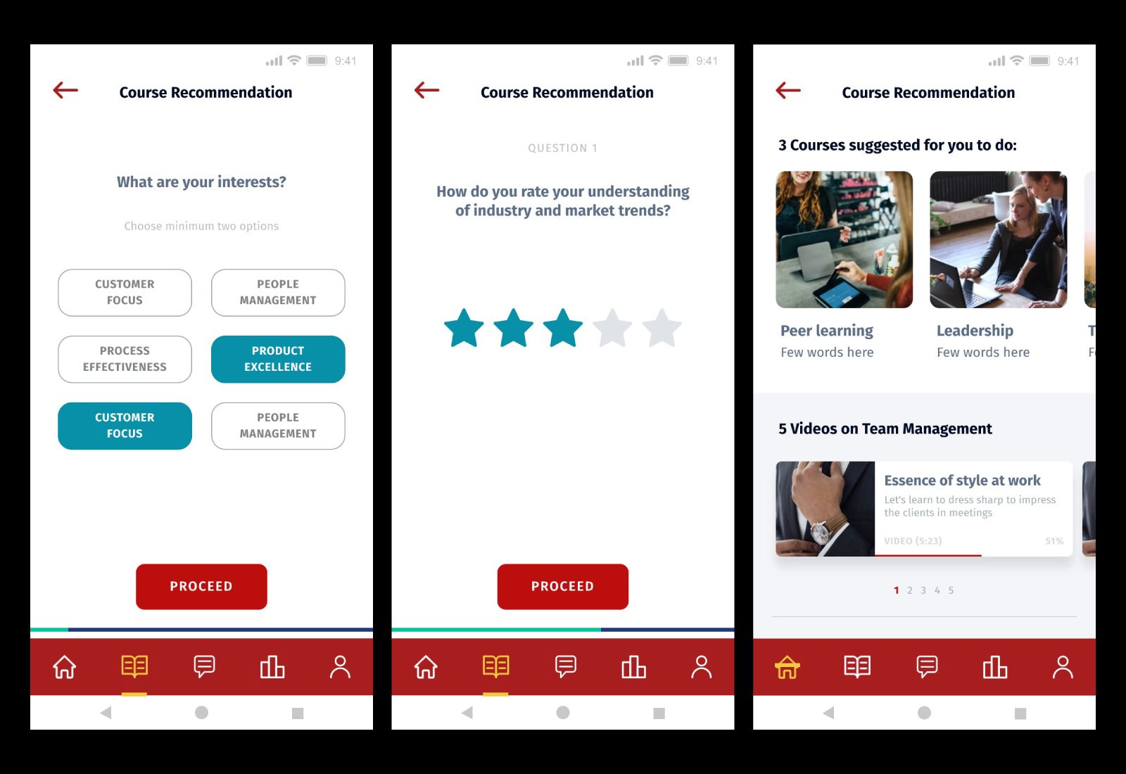
The course recommendation UI shows up after clicking on a notification. It helps the users curate courses and content based on their interest.